react-modern-datetime-picker is a powerful, highly customizable calendar and datetime picker component for React applications. Designed with a modern material UI, it supports multiple picker variants from simple date selection to full datetime picking with time controls, date ranges, and multi-date selection all in a single, lightweight package.
Whether you’re building a booking system, a scheduling dashboard, or a data-entry form, react-modern-datetime-picker gives you complete control over appearance, behavior, and accessibility.
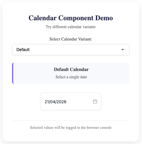
- 4 Picker Variants : Default, Time, Range, Multi-select
- Full Theme Control : Customize every color primary, background, text, borders, hover
- Custom Icons : Inject any React node as the input icon, left or right
- Internationalization : Locale support, custom date formats, configurable week start
- Date Constraints : Min/max dates, disabled dates, disabled days of week
- Time Picker : 12 / 24 hour format, minute intervals, optional seconds
- Keyboard Navigation : Full accessibility with ARIA support
- Zero Dependencies : Only peer deps:
reactandreact-dom - TypeScript First : Complete type definitions included
- Responsive : Mobile-aware modal positioning